Author Archive for Mark Laporta


28
Oct
12

Jigsaw Messaging & the Culture of Executionalism

Despite 15 years of lead time, digital marketing has yet to resolve one of its most pressing issues: The effective, memorable staging of a message across a hyperlinked array of multiply cross-referenced pages.

In the mad rush to git-r-done, the majority of brands have adopted one of three offline models—the print brochure, the print magazine or the print catalog. In the process, they’ve short-circuited the evolution of the most important new communication medium in 70 or so years—and fostered a climate of mistrust they struggle against every time they reach out to consumers online.

What’s the big deal? It’s the failure to grasp the interdependence of content density, design and messaging strategy.

The seeds of the present state of digital space lie in the manufacturing model that has gained ground over the last decade. This mindset puts a premium on recycling content, design and video assets in the mistaken belief that consistency is synonymous with branding.

Copy cut to fit.
Hand in glove with this delusion goes an attitude toward copywriting analogous to a typical home-owner’s attitude towards carpet installation. Today, like carpeting, copy is shaped to fit whatever space is left between the stock art. Writers are enjoined pick up copy from an existing source and set to work with no regard for its relevance to the underlying concept.

Approached with this mindset, it’s no surprise that the majority of Web copy hits a low standard. No, not for the quality of the writing, for writing itself plays an insignificant role in motivating consumers.

In fact, effective copy is only the surface manifestation of a thorough-going thought process. That’s why the incessant wrangling over individual words that constitutes 98% of all discussion about the topic is such a complete waste of time. What’s at stake is neither the presence or absence of wordplay, the relative formality of the grammar, the invocation of traditional imagery, or slavish conformity to mechanical “trade secrets.”

Instead, the only issue of consequence is whether you’ve crafted:

• An emotional connection to your customers
• An unambiguous and credible point of view on topics they care about
• A demonstration of real value
• A clear statement of how to access that value

Context & Clarity.
Clarity. The word crops up in every discussion of branded communication. But clarity, like most other human values, is relative; its definition shifts from context to context. For example, a clear communication about distemper aimed at veterinarians is a different animal from a clear communication about the same topic, aimed at dog owners

And only a small part of that difference has anything to do with words.

The real distinction lies in the path you take through the material, the structure of the message, not its terminology, diction, tone, length or—oh please—”style.”

On the other hand, there’s one thing that every clear communication shares: Proper staging, a carefully controlled roll out of the communication’s deep message. 

Scattered.
Trouble is, instead of mapping out a coherent messaging strategy—including a coherent way to present it visually, the average Web page is simply “stuffed” with content. The result is crippling information overload.

Again, this is not about words, but message and structure. In their manic frenzy to offer something for everyone, brand managers frequently overload the structure. As a result, they fragment and scatter their message, like shuffled pieces inside a jigsaw puzzle box—leaving users to assemble the big picture piece by piece.

While the sources of this “drunken style” of communication are many, it stems in large part from a culture of executionalism rooted in desperate money-grubbing. Skipping the concept and messaging stage, many creative directors believe the first step in any project is to create an eye-catching-yet-reassuringly-conventional “look.”

Sure, they’ll revolve the design loosely around a metaphor, but that’s as far as the creative process goes. Ask about messaging and you’ll be directed to the tagline, the About Us section of the existing site; you’ll also get the standard sermon about the need for “fun headlines” and copy that’s “short and sweet.”

With a mandate like that, copywriters can only fill in the blanks and hope that a few shreds of metacommunication will survive the scrutiny of the Minimalistas, those stern throwbacks to an isolated strain of 20th-century modernism. In that case, there’s still a faint hope some inkling of a larger brand narrative will seep through the tiny cracks left by rigid design ideology—and the client’s desire to make everything “pop.”
13
Oct
12

Towards a Stream-Dipping Model of Advertising

The idea of a “campaign” encompasses a set of assumptions ingrained in advertising culture. When we talk about launching an advertising campaign, we’re just as excited as the people who launched the moon rocket. It’s what we do: if we aren’t firing off a concept, we’re providing support services to keep it in orbit as long as possible.

In today’s environment, most people would agree the phrase “moon rocket” sounds archaic, even comical. But in that same environment, I’m starting to wonder if thinking in terms of campaigns might be just as archaic—for down-to-Earth reasons.

Working the crowd.
The more I realize how much the world has changed in 43 years, including our everyday concept of what “the world” entails, the more I question the effectiveness of the launch-and-reentry model of advertising.

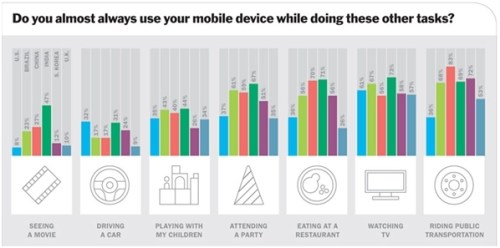
Here’s the thing: communication is now a continuous stream for an ever-larger swath of the population:

Time_excerpt_mobility_poll

[Excerpt, The Time Mobility Poll, 2012]

In light of this, reaching consumers persuasively may require a solution more comprehensive than extending a campaign idea with Web-relevant tactics. In a global sense, it may mean the end of the start-stop pattern of launch, promote, tease, extend, launch, promote, tease, extend…

Instead, it might be more effective to develop a single distinctive voice for your brand and broadcast it in a way more idiomatic to our increasingly digital culture. Using this voice, you could dip in and out of the digital stream, making waves, stirring up excitement—and sampling the ecosphere.

You’d build your communication around themes relevant both to your brand and your audience. Like a stand-up comic, you’d offer a fresh point of view on a range of topics, adapting your material on the fly.  

Off the pedestal.
In the process you’d learn how to connect more immediately to your audience. Instead of standing aloof on a flatscreen, a billboard, an envelope or a POP display, you’d be swimming downstream with the whole human race. Best of all, your message would be continuously developing, evolving, adapting, responding, like the everyday communications that people actually cherish.

You’d also opt out of the all-or-nothing gamble of constantly wrangling for a new message angle. You’d just be you—speaking in your own recognizable voice. 

Blurring: The new clarity.
Now, what I’m proposing has little in common with the obsessive chatter of foursquare updates or twittery trivia.  Your stream-dipping message strategy would deliver value in real time. It would be agile, lithe and responsive—able to seize on opportunities for timely commentary while staying on course to deliver a carefully staged message throughout the year. 

And without the pressure to “launch by the 30th,” you’d steer clear of classic, deadline mediocrity, the sickly pall that turns even the most memorable concepts into forgettable oatmeal.

What would a stream-dipping campaign look like? Exactly. It wouldn’t be solely text-based. You’d post video, animation and digital stills everywhere and anywhere you could fit your message to the surrounding context. And with that in mind, this approach would take far greater advantage of cross-promotional opportunities. 

In practical terms, going this route would also mean transforming the way you work with vendors and how you manage media placement. I haven’t forgotten that a store needing a holiday display also needs to install it in time for the holidays. 

It’s just that the message you displayed would reflect recent topical events in the stream. Instead of hawking “the Perfect Gift for the Holiday Season,” it would address the real-time experience—the highs and the lows—of making holidays work in a post-modern, post-traditional society

Tuning in to a riotously fragmented culture. 
That may be the only way to match your brand’s personality to the multifaceted, instantaneous nature of today’s world. Just as your audience typically has multiple windows open at once—from IM to email to RSS feeds to a crazy quilt of social tools—so your brand could also become more fluid, multifaceted. 

Over time, you’d find yourself blurring the lines between your brand and complementary brands. The more you grasped the power of mimicing your customers’ fragmented, and increasingly multimedia experience, the more pointless it would be to create a forced reintegration of that experience around isolated, disconnected brands.  

Is a stream-dipping model feasible? Well, it can’t happen overnight. But as a mindset, an ideal to strive for, it may be the best way to ride out the wave of change that washes over our industry with every spin of the apple. 

18
Sep
12

The Home Page Opportunity (6)

[September 18, 2012]

No matter what else you post on your Web site, know that nothing impacts consumer engagement more than the opportunity presented by your home page. More often than not, however, that opportunity is squandered with flatter-than-flat conventionality, by people sworn to uphold best practice. 

How do you seize this opportunity? Well, it’s complicated. But there’s one thing I do know: recycled debates about false dichotomies—like traditional/modern, simple/complex, or authentic/contrived—will get you nowhere.

What we might begin to discover, however, by looking at two examples, is the thought process most conducive to consumer engagement. Where this process leads is constantly up for grabs—and that’s it’s greatest strength. Side-stepping the determinist pseudo-science of standard UX theory, a truly creative process defines success or failure solely in terms of the facts on the ground. It’s a process characterized by the freedom to improvise. 

Take, for example, the home page of The City 2.0, whose marquee area grabs attention with type-design free of print-design agendas. At the same time, the button-free navigation is a refreshing change from the tech-console mock-up that’s one of Web Design’s many undead cliches.

Here, the navigation captures the mood and spirit of the site as well as to the movement the site aligns with. Before users start interacting with the content, they get the subliminal message: The City 2.0 is about overlapping spheres of influence and their potential impact on the future of urban life.

None of that would matter if the site didn’t confirm that message with clear, thematic headlines. Not, that is, with mechanical wordplay, loftier-than-thou foundation speak or cheeky aphorisms ending in “shouldn’t be.” And to help users engage, the design hierarchy delivers the what, where and why-you-should-care about each article in a single linear process.

Finally, this home page works because it matches the action-oriented spirit of the organization. It’s laser-focused on action. It speaks one message with one voice and wraps itself in a tightly unified design that nevertheless feels free-floating, relaxed, inviting–and human.

Tapping the desire to acquire
Pitched to people for whom shopping is a primary mode of self-expression, the home page of Uncrate.com draws users in from its first pixel. Though displayed with little obvious fuss, the product-shots are crisp and clean—to the point of being seductive. The deft design is inconspicuous, residing in a fine sense of proportion, light, airiness—exactly what you need to make manic impulse-buying feel like the most natural thing in the world.

Another appealing aspect of this home page is the opportunity it gives users to switch from the standard layout to a grid view of its featured products. I can’t think of much that’s more welcoming on any Web page than some input into what users see, read, or hear. It gives consumers the faint hope that they matter to the brand. 

Of course, you can go to BestBuy.com any day of the week and sort product displays by this that and the other criterion. But by giving people control over the homepage, Uncrate’s clear message is Inclusion.

Here again, the button-free navigation is a walk away from the tried and true. Just as understated are the callouts leading to a range of different promotions. Understated, that is, in that they make their points without violating the mood or voice of the page.

Design that says “hello”
What’s selling me on both of these contrasting sites is the sense that somewhere behind the scenes at each brand are people who actually want to make contact. Their offerings are direct, transparent and without gross manipulation; both sites approach users as if they matter as much as the mission statement.

That each site accomplishes this with design as well as copy shows what can happen when these two elements, so often—and so foolishly—conceived as separate functions, are allowed to evolve together. It’s no surprise that such an approach lends both a more human feel. Because, in case you hadn’t noticed, everyday human communication occurs between people who are seamless entities—for whom the boundary between appearance and content simply doesn’t exist.

While psychologists have introduced and promoted the concept of “body language” over the last 50 years, the phrase is essentially redundant. In real-time conversation, language consists not merely of grammatical structures, but of gesture, vocal tone and volume, facial expression, speech rhythm, pacing and even body odor

It follows, that you can’t hope to take full advantage of the opportunity presented by a Web site’s home page without modeling your efforts on everything that happens when people communicate in the real world. Including, I hasten to point out, the realization that you’re not just talking to yourself.

M4FTS5YTG4WX

23
Aug
12

Consumer Engagement: Getting Past Meh

[August 23, 2012]

Meh.” 

Of all the reactions you hope your consumer engagement strategy will elicit, this is the one to avoid. Trust me, it’s far better to aggravate your customers than to leave them cold, indifferent, in a state beyond either praise or contempt. 

While I’m pretty sure most marketers agree with that in principle, it’s not clear from the facts on the ground that avoiding “Meh” is their top priority. There are surely many reasons for this, but I believe the simplest is an overabundance of self love. 

Take a look at a typical promotional effort in any medium. The subtext is clear: 

My brand is really special and I have the bullet points to prove it.

It’s the little white lie that just keeps on giving. But if your goal is to move the needle, know that talking about yourself is guaranteed to glue that sucker down for good. Even if you summon the Gods of Consumer Friendly Language and prostrate yourself before the altar of received opinion, your offering will go unheeded. Audience response is still liable to be:

“Meh.”

Close the Marketing 101 textbook and look around you. In 2012—as in 2000, 1990 and 1980—consumers can already see through the advertising smoke screen. Doesn’t matter if you go Old School traditional or doll up your communication with the phrase “Like us on Facebook for more special offers.” They get it. They’re on to you. 

If I had to guess, in this Trust No One culture we’re brewing for ourselves, it won’t be long before the ability of any advertising medium to impact consumer behavior will be permanently compromised. Increasingly, if consumers buy your product, it will be for their own reasons.

But not because of questionable benny bullets, happy face stock art or a phallic staccato delivery. In this environment, your targets are more likely to buy because a favorite celebrity owns your product, endowing it with a cool factor no MBA degree holder can manufacture.

So where does that leave us, we who struggle to motivate consumer behavior?

Cause and “Affect”
Well, obviously, we’re doing something right, or there’d be no cool factor lift at all. Trouble is, the wellspring of cool, broadly defined, doesn’t reside where we’d like to think it does, in the realm of marketing theory. Instead, it resides in the emotional touch we sometimes manage to make—in those rare moments when we accurately reflect a trend rather than slavishly imitate one or arrogantly try to set one.

As I see it, that’s the crucial distinction. Be as clever as you like. Your efforts will fail—unless you have the humility to respect your customers. That is, a respect that stems from knowing them well enough to accurately articulate and validate their experience. 

Exhibit A: Those smiley-face families in a typical 30-second car commercial. The only way you can honestly produce imagery like that is if you’ve never taken a road trip with children under 12. That’s not to say a car campaign should depict the grim reality of changing diapers in the backseat at 60 miles an hour. But you might think to dial down the gloss and the smarmy nonsense about “what brings us all together.” 

That kind of insincerity? Meh. Tell consumers something that might help them on their road trip. Like how to plan a kid-friendly route or what to say when “Don’t make me turn this car around” doesn’t work anymore. Don’t be scared off by addressing Reality. Respecting consumers doesn’t mean sanitizing your communication to avoid anything objectionable. It means acknowledging what customers already know: Life is neither the pinnacle of hope only you can help them attain—nor the depth of despair only you can help them escape.

So go ahead, say something useful (“Fun Facts” don’t count). Your target just might look up from the latest episode of NCIS to give your product a second sniff. Reinforce that behavior by never, ever glossing over their unique selling proposition to get to yours. Reflect the sentiments, the values, the desires of your customers’ real-world selves and you might have a snowball’s chance of getting past their drop-dead boredom with off-the-shelf Consumer Engagement Strategy. 

Otherwise, it’s time to consider reinvesting your advertising dollars in the companies that build remote control devices. After all, your bland, formulaic communications have already done more than their share to ensure these companies never go out of business.

07
Aug
12

Unrisky Business & the Frozen TV Web Site

[August 7. 2012]

As I see it, the majority of Web sites are generic. It’s not surprising. Their development is driven by an interlocking series of theoretical dogmas and engineering / technical mandates. With only the slightest effort, you can Google up a whole passel of rules for every single component of Web site development.

Max Design 
Useit: Alert Box 
U. Minnesota / Duluth
Bruce Clay
Smashing
Etc.

Though many of these rules are purely technical, many claim to derive their authority from behavioral science. Trouble is, there’s little in the focus group approach to data gathering—that shamanistic ritual we’re pleased to call usability testing—that remotely resembles real scientific inquiry. In fact, the only behavior these sessions can quantifiably predict is the behavior of the people evaluating this data.

As evidenced by the current state of digital space, the majority of Web site developers will interpret this data in astonishingly literal terms, seeking to make a one-to-one correspondence between each factoid and some component of the final result.

And that result is so uniform, so predictable, it’s a wonder users can tell one cloned Web site from another:

Clonesite

Like the frozen TV dinner in the Jim Jarmusch film Stranger Than Paradise, this clone has everything. You got your slideshow marquee, you got your audience poll, your Fun Facts, your dynamic data updates, your celebrity shoutouts, and you got your viral video. It’s the slack-jawed, slacker’s response to the challenge thrown down by digital communication and it’s subtext is clear:

¡Please, Oh God, please find something you like on this page!

At one point in the history of Web site development, I suppose it was possible to sit back, cluck your tongue and say, “Well, digital communication is still in its infancy. It’s still early days and the technology is still growing.”

But with the emergence of HTML 5, CSS3, JQuery and a host of other programming tools, I’d be hard pressed to attribute the Internet’s global mediocrity to a lack of technical polish.

It’s attributable, more likely, to a generalized fear of flying. To dare to communicate takes the courage to risk offense, rejection and attrition. Yet nothing, in my experience, was ever sold by saying “Won’t you please buy my product, it’s really pretty good.”

On the contrary, to sell, you need to get out there—but that’s the last thing the non-committal, falsely hierarchical, gutless Web site clone is willing to do. Communication? Not a chance. Rather a drab floral arrangement of predictable engagement tactics, preferably those already sanctioned by years of use. Anything else would smack of risk—the one thing our opinion poll-driven society absolutely will not tolerate.

Where to go from here? Nowhere but up. Yet, the solution to the generic Web site epidemic will not be a new Theory of Engagement, let alone the unveiling of HTML 37. It will arrive in the form of a simple realization: There’s no way to test your wings in digital marketing without flying in the face of conventional wisdom.

25
Jul
12

Evaluating Headlines: Microscope or Kaleidoscope?

[July 25, 2012]

What makes a good headline? It’s not an open and shut case—no matter what school of thought you subscribe to. That’s because, contrary to conventional wisdom, a headline is not an object, like a gear or a transistor to be stamped out to engineering specs on demand. Instead, it’s the end product of a thought process, and it’s the quality of that thought process, rather than any extrinsic standard, that’s the true foundation of a successful headline. 

As a result, effective evaluation of a headline requires you to set aside abstract notions of word count, diction, “style” and—most important—the presence or absence of puns, alliteration or wordplay. Forget your slavish devotion to the gods of Simplicity, Strength and Speed—and just listen.

Listen to the headline in the broader context of the actual communication in front of you. It might take practice. In a world fairly dripping with marketing, it’s easy to forget that headlines have different structures and functions in different advertising media.

Whereas a headline in a magazine has to do almost all the heavy lifting to keep users from flipping away, on TV, a host of other elements, not the least of which is motion, are available to grab and hold attention. In the multidimensional landscape of digital space, on the other hand, a headline needs to be tightly integrated into an intricate network of reference and cross reference. 

That is, of course, unless the site in question is the hapless assemblage of off-the-shelf design and programming elements typical of many digital retail environments. Not that more than a handful of Web sites manage to strike this balance at any one time. 

Approximately 15 years into the digital era, the exact role of creative copy—as opposed to “content”—in digital communication is still poorly defined. That’s why, in so many cases, what passes for a headline is merely the topic sentence of an article or advertorial, propped up on a giant font like a circus clown on stilts. 

Get your specs on straight.
So, having correctly adjusted your sights for the medium in question and sent Prescriptive Ideology to its room with no supper, what’s a sensible, efficient and creative way to evaluate a headline? 

Start by realizing that, all other considerations aside, a headline can be either literal or allusive, but not both. Nothing bogs headline development down faster than sending a copywriter on a quixotic quest to say everything about the brand in one sexy, dynamic, witty, trendy and culturally sensitive phrase, preferably of no more than four words—five, if the latest TED video says it’s OK. 

Unfortunately for everyone involved, initiating such a quest sets contradictory forces in motion and adds another chapter to an epic saga: The clash between the explicit and the implicit. For while some people take it for granted that a headline’s only function is to proclaim a product feature, benefit factoid or discount offer, others seek to encapsulate an entire brand promise in a catch phrase open to multiple interpretations. 

Adjust your focus.
Which approach is correct? As I see it, that’s the wrong question. In evaluating a headline, what’s relevant is, again, the thought process at the heart of the endeavor. Though classic promo-copy, generally speaking, makes my soul weep for the fate of humanity, there are times when it’s the only way to go. 

After all, if the only thing on your mind at the moment is 

“SAVE 15% ON GARDENING SUPPLIES, NOW THROUGH AUGUST 15th” 

…there’s no point in beating around the bush. By the same token, if your messaging strategy is all about discounts, I have no incentive not to jump from one retailer to the other—whoever has the best deal. 

So if, to compensate, you want to capture my loyalty, you’ll need to do some relationship building. That’s a different thought process and, necessarily, requires a different sort of headline, which must meet a different set of criteria.

What this points to is the exaggerated pressure put on copy execution, and creative execution in general, to move product and boost brand awareness. It suggests that, instead of sweating the small stuff through 21 rounds of revision, it’s more profitable to do the heavy lifting upfront. How? By working out a branded thought process for each quarter and developing effective materials to express it. 

Not, mind you, with stencils punched out of the latest Best Practice Activity Book, but with real insight into what your audience—a group of people just like you in every meaningful detail—needs to feel motivated, honored and entertained by your brand. It’s a goal you can accomplish only when you stop burdening the creative process with microscopic micromanagement and open your mind to the kaleidoscope of human emotion.

15
Jul
12

Marketing 909: Selling as Conversation

[July 15, 2012]

In the realm of e-merchandising, there’s constant tug of war. On one hand, the desperate calculus of sales-per-quarter, which is tracked, fretted over and tracked again by nervous sales managers and retail buyers, whose reputations are only as good as this week’s numbers.

And, of course, in this sector of digital space, there’s no metric wiggle-room, no theoretical evocations of click-through or “stickiness.” It’s sale or no sale—a black / white dichotomy only slightly shaded by the nebulous success achieved when a bored user clicks “sign up for product updates and special limited-time offers.”

At the other end of the rope, pulling just as hard, is the brand imperative—the essential and rather elusive attributes we like to call Trust, Advocacy and Word of Mouth. After all, what good is it to offer products no one believes in, no matter how often you shout “LOWEST PRICE, GUARANTEED” in no matter what size font. And how do these attributes accrue to your brand? It’s a gradual process of introduction, seduction and (product) satisfaction. 

As I see it, one brand that has transformed this awkward push-you-pull-me dichotomy into a graceful balancing act is Pottery Barn. By whatever twist of fate potterybarn.com succeeds where many have failed, to produce a merchandising site that captures both the thrill of impulse shopping and the aspirations of its audience in a classic, branded environment. 

To start with, the graphic style on the home page and elsewhere brings Pottery Barn’s wares directly into your field of vision. Your view of the objects in the main marquee is “subjective,” immersive enough to make garden variety product shots feel more like vacation photos taken on the fly in a spirit of fun.

Balancing the equation with value.
But the customer-focused orientation of the site goes way beyond making the wares look good enough to eat. For potterybarn.com is organized, start-to-finish, as a comprehensive tutorial in one kind of interior design. You don’t need to share the brand’s taste or color palette to appreciate the value the site delivers to its audience. While the site also provides links and contact information leading to available offline consultation, the amount of advice available on the site is, for many people, at least as much as they need.

A typical example of what’s on offer is the Living Room section, where users can get a feel for how different household accessories work together. Click a suggested ensemble, then mouse over the main image, where in an elegant touch of DHTML programming, you can magnify sections of the image and click to see more details. The ever-present shopping cart links notwithstanding, you can’t escape the sense that someone is not merely selling, but bothering to explain what you see.

And, refreshingly, there’s none of that “HOW MUCH WOULD YOU EXPECT TO PAY FOR THIS GORGEOUS LIVING ROOM SET? $1000? $1500?” nonsense. 

That the site also offers advice on entertaining guests, is another indication that the brand’s focus is on customers rather than on merchandising. The fact that, of course, Pottery Barn’s suggestions for entertaining, like those for design, decorating and so on, are all linked to products for sale is beside the point.

What the brand has accomplished with this site is a convincing integration of merchandising and branding. That it also transitions seamlessly to social space—by establishing a convincing presence on Facebook, Pinterest, Tumblr, YouTube, Google+ and Twitter—should surprise no one.

Person2Person. Respect.
By striking the delicate balance between selling, branding and delivering value in real time, Pottery Barn’s site exemplifies some of the best in recent marketing trends, an example in woefully short supply, especially in the consumer pharmaceutical marketing arena—where communication strategies, audience segmentation theories and consumer motivation models from the 1970s go home to die.

Yet, we need to look no farther than another major online retailer to find equally egregious hucksterism. As you’ll discover at the Web site of any major airline, the mere presence of a logo and a tagline is all that suffices to distinguish one dollar-grabbing monolith from the other. Could it be that, having trashed its own credibility over the decades with lousy service, over-priced tickets and lost luggage, airlines see no reason to Try Harder? I’ll leave that thought for another day.

At issue here is a simple realization: In 2012, selling is conversation and the conversation is all about the consumer. Pottery Barn understands that. Perhaps it can serve as a model for marketing that puts the consumer first—not merely out of consideration for the real people who deserve your real consideration—but because that’s what sells in a world where customers own the power of the click.

29
Jun
12

Journey to Bannerania (3)

[June 29, 2012]

Though digital success is often measured in terms of click through, a large percentage of digital objects don’t get any. Here’s why. In the frenzy to “top-line” the message, a great many brands try to tell the whole story upfront. But if your message is that explicit, why would anyone need a click to “learn more?” They get it already, you want to sell them something.

Imagine a retail sales rep who’s opening line to you was,

“Now you can save up to 50% on your next microwave!”

…when you only came in to buy a set of dishes.

That’s a scattershot approach to sales that would only appeal to customers with no social skills and an obsession with houseware discounts.

Fortunately, a more open-ended approach is fairly universal in the offline world. That’s because sales is about seduction, and seduction goes from the general to the specific, not the other way around—something a talented sales rep understands intuitively.

So if increasing click-throughs is that nagging item on your to-do list that never gets scratched off, you might want to rethink your approach to online engagement.

False premise.
Now, chances are, you look at your banner, advertorial, page take over, etc. as the perfect analogue of in-store signage. You may even expect such signage to be more effective in digital space, because it’s “interactive.”

I’d like to suggest the root of the click-through problem lies in the fact that this is a false analogy. To users roving hither and yon over digital space, your banner isn’t merely your signage, it’s the entire store. After all, in the largely unarticulated landscape of boxes that characterize the overwhelming majority of our Web pages, your banner is as much a point of arrival as any Web site’s home page.

Add to that the familiar home page layout, which includes a banner-like object centered in the marquee, and you reach the heart of the dilemma. The headline-in-a-box formula is so ubiquitous, it’s the visual equivalent of background noise. So much for effective signage and so much less for an engaging, branded experience.

Making matters worse, the standard promotional banner has too narrow a focus to be welcoming and does nothing to remind its audience why they should care about the brand.

“Save up to $25 on a product you can’t remember the value of,” these banners scream. When coupled with legal lingo to the effect that terms and conditions apply, you’ve created a classic Later-for-That Scenario. Why should a customer click through unless he or she is ready to buy right now? And if the offer is tied to joining something, it’s all over.

False promise.
In most cases, becoming a member of the XYZ Support Program is to fall victim to a flood of emails with cardboard advice like “Reward yourself for taking your medication.” In the current climate, it doesn’t take consumers long to realize you’ve collected their personal data for your own selfish reasons. 

So if you’re going to include digital banners in your marketing mix, realize that they come with baggage—a 15-year legacy of disappointment—growing out of their failure to make a meaningful human connection.

OK, I’m familiar with the line of logic to got us where we are today. It’s the line about hard-hitting, no-nonsense, short-and-sweet, just-the-facts communication that gets results. It’s a line of logic that’s repeated regardless of whether those results are ever forthcoming. Why? 

Because—and only because—it narcissistically reflects what many of industry professionals would like to believe about themselves: That every day, they slam a cup of mocha java down on their desks and get stuff done!

Walk away from denial.
If you’re up against the wall with click-through rates that no amount of regressive analysis can spin, try a counter-intuitive tack. Instead of shoving an offer in your customers’ faces, set up an intriguing premise that grows naturally out of your brand narrative and gives your customers a reason to “learn more.” Then reward that click with entertainment, exclusive content, or a thoroughly original point of view about topics close to their hearts.

Show them a good time, in other words, and they just might take you up on your offer. And along the way, they’ll have absorbed so much more about your brand message than you’d ever be able to cram into one of those pointlessly limited 720 x 90s with just enough room to scrawl HURRY WHILE SUPPLIES LAST.

19
Jun
12

Messaging Strategy: The Myth of Simplicity

[June 19, 2012] 

“Keep it Simple” is a phrase often accompanied by a tight-lipped frown or a horizontal snap of the hand at the wrist. The idea being, of course, that whatever qualifies as simple is inherently better, faster and—holy of holies—brings you as close as possible to a thought-free existence.

Maybe it’s just me, but I find the notion of Simplicity one of the most complex social constructs we’ve got going on. For one thing, there’s the sheer mutability of the concept, the way it expands and contracts to fit the needs of the moment.

Face it, whatever you consider your irreducible minimum is what you’ll call “simple.” More than that is “cluttered,” less than that is “stark.” And your minimum shifts from context to context. If your concept of a simple lunch is cheese, fruit and a glass of wine, there’s no guarantee your idea of a simple house won’t include an acre of land, a swimming pool, three bedrooms, a finished basement, a patio deck and a two-car garage.

Fact is, Simplicity is a shape-shifting trickster, a phantom ideal with its origins in one strain of 20th century Modernism. Like it’s older cousin, “Naturalness” which emerged in 18th century France, Simplicity is the very exemplar of language as thought-control. 

Can’t actually defend your aesthetic or technical goals? Evoking Simplicity is the perfect way to silence opposition. That’s because, as a pseudo-modernist worship-word with no fixed definition or frame of reference, Simplicity can mean anything its smug advocate needs it to mean.

A delicate balance. 
Now, I’m all for having an aesthetic, a set of standards I can use to measure my work and a set of premises to establish a context for my ideas. But aesthetics alone have never produced a meaningful, much less effective piece of work. I’d go so far as to apply that statement to the highest works of art in any medium, the realm where, many people believe, aesthetics is everything.

But that statement goes double for practical, work-a-day advertising, including advertising intended to raise awareness of a lofty social cause. And that means there are times when Simplicity, as an ideal, must take a back seat to functional imperatives.

Though your preference might be for Zen-inspired spareness, you might need something as Baroque as an entire paragraph to make your mission, your product, your offer clear. So a preliminary discussion about content density needs to happen way before the design team starts cloning Piet Mondrian or Constantin Brancusi.

Keep what simple?
Speaking of density, know that a presentation can only be as simple as its underlying premise. A simple presentation of the amendments to the United States Constitution? Unlikely. You might strive for the fewest words, the most stripped-down imagery, but you can’t adopt the Mint.com paradigm. That is, unless your treatment is too top line to be meaningful.

And that’s where many an ultra-streamlined, One-Show candidate gets battered by a storm of content density and washes up on shore. To be clear, I’m not talking about content as in words on the page, video in the window or the polls, widgets and “interactive tools.” 

I’m talking about the core brand promise. You want simple? Start by recognizing that a simple surface can only rest on a clear, uncluttered foundation. Simple communication is incompatible with spraying 100, often contradictory, statements at users from a digital fire hose and hoping one of them “resonates.”

Cherchez L’anxiété.
Time was, when brands understood the true function of a tagline—as in “Pan Am Makes the Going Great“—a simple promise had more than enough elbow room to work its magic. Sure, every age of advertising has had its share of space-filling, benefit-bulleting baloney. But if simplicity is your goal, the irreducible minimum is a unified hook you can hang your pitch on.

In today’s ideology-driven theoretical environment, that’s difficult to achieve. In 2012, the old Pan Am tagline would surely spark of a firestorm of Marketing Anxiety:

• What if users don’t remember that Pan Am is an airline?
• Do we think people know that “Going” refers to air travel?
• We have research that says “Great” doesn’t resonate unless you put it in context
• How can an airline “Make” anything? They aren’t manufacturers, so this totally doesn’t track.

With all of that backstory going on, you’re asking Creatives to “keep it simple?” Fine. What you’ll get is the status quo—a babble of conflicting communications saying practically nothing by promising practically everything.

06
Jun
12

Why You Wanna Be An Advertising Hater?

[June 6, 2012]

If you’ve never tried it, Google the phrase “people hate advertising” and introduce yourself to the lore surrounding the myth that advertising is dead or dying. In a country that has integrated the principles of advertising and related fields into every aspect of daily life, that assertion is painfully ironic.

From parents packaging their kids for college, to self-promotion in social space, to the onset of late-stage reality programming, the boundary between presentation and substance has been eroded. Think you’re immune? Ask yourself the next time you pull on a T-shirt with an alligator, a polo player, a “swoosh” or an American flag embroidered on its chest—and willingly become a walking advertisement.

And yet I continually hear that people hate advertising.

Yes, the remote control was invented in 1956. Yes, click through rates on digital banners are low. Yet, strangely, the word gets out—about Google, Gaga and a gaggle of other products. Ten or 12 years ago, the only people carrying dataphones were workaholics. Now they’re the indispensable fashion accessory for anyone hoping to hook up. Why? Because millions of people were sold on them, in part with advertising—whether they hated it or not.

“…are greatly exaggerated.”
The “Death of Advertising” myth is linked to three delusions. The first arises from the assumption that you can take people at their word. Trouble is, what people mean is not determined by the literal definition of their individual words, but by the cultural context in which their words are spoken.

So, for example, in a time and place where it’s fashionable to say you hate advertising, you’ll say it—if only to improve, ironically, your personal brand. Hating advertising then becomes a way of positioning yourself as a member of a subculture.

The second delusion stems from the belief that mobile and social media marketing are killing traditional advertising. Brands, we are told, “don’t need to ‘sell’ online” because they have a host of new strategies. But whatever’s going on at social sites and the iPad nearest you is advertising.

And it’s no less “traditional” than an archaic 30-second spot, because the underlying premise is the same. The goal of either approach is linking brand attributes to key characteristics of your audience. Are you inviting users to share what they love about your product? You, my friend, are advertising.

Finally, it’s also a delusion to assert that hatred of advertising keeps advertising from getting results. Of course, if you believe that the function of advertising is to generate “good metrics,” you’ll always be disappointed.

Science, not so much.
While we would desperately like to believe otherwise, marketing and advertising are not sciences. There’s no knowing how any ad affects your customers. That’s because every ad floats in a sea of your customers’ social and cultural interactions—including every other ad they experience.

We can’t claim to know precisely what tips the scales in our favor, any more than we can settle the nature vs nurture argument on any other level. Let’s face it, even in the glory days of direct marketing, response rates were subject to the Clever Hans fallacy at least half the time.

Sweet seduction.
We also can’t ignore the possibility that some people hate advertising because it works. If they realize that an ad they muted yesterday was the one that finally convinced them to buy, they may feel resentful about “being seduced.”

Now, as I see it, anyone over 22 who doesn’t realize that seduction is the basic vocabulary of all human interaction has led an unexamined life. What’s shocking to some people, apparently, is that they too, at all hours of the day or night, are either seducing or being seduced to different degrees.

Ultimately, the source of the “Death of Advertising” myth lies in the belief that advertising consists of the objects advertising agencies produce. If your idea of advertising is TV spots, print ads, Web pages, digital banners, packaging, advertorials, POP displays, etc. you’re confusing cause and effect.

For those are only advertising media. Advertising is a message and if that message weren’t getting through, we’d have no consumer market. A trip to Best Buy would be a nightmare, as you confronted row after row of undifferentiated black boxes. Mac? PC? Toaster? You’d never be able to tell them apart.

No, if we truly believe that people hate advertising, the answer isn’t to kill the category, but to upgrade the quality of our product. It’s a process that begins the moment we stop thinking of advertising as an object to love or hate, and recognize it for what it is: A communication process whose objective is motivation.


Unknown's avatar

Mark Laporta

Writer, Creative Consultant
New York, NY

m.laporta@verizon.net
LinkedIn

Archives

______________________________

Enter your email address to receive notification of new posts.

______________________________
______________________________
Top Marketing Sites
Blogarama - The Blog Directory
Marketing Blogs - BlogCatalog Blog Directory
Alltop, all the top stories
HE Blog Directory
WEB LOG SHOW
Subscribe in Bloglines
Add to Google Reader or Homepage
______________________________
______________________________